There are quite a few moving components that all interlink with each other when determining reasons for startup success. Right off the top of my head, certain elements come to mind such as the interoperability of the team, the concept itself, the timing, the competition, the saturation, the innovation, and pretty much every other buzz word in the tech/startup industry you can possibly think of.
Now of course, some of these concepts takes days, weeks, months, and even years to accomplish. Furthermore, if there are specific challenges involved, it may take even longer. We’ve all heard about the startup who took 2 years to get their final prototype ready for market launch, or the other startup who took 8 months to finish their initial financing round, there’s a ton of things out there and we all know startups have to be fluid and flexible. But there is one simple thing that you as a startup founder or startup member that you can implement, to greatly increase your success rate of being overwhelmingly awesome.
In short, follow good pitch deck design rules, and make your pitch decks a PDF.
"There is one simple thing that you as a startup founder or startup member can implement, to greatly increase your success rate of being overwhelmingly awesome. Make your pitch decks a PDF.”
@hat? I can hear you saying it already in your own head. What does creating my pitch deck as a PDF have to do with anything? Doesn’t this guy have better advice to offer me, I mean this blog is coming from a startup accelerator. A PDF file hardly seems to accelerate anything!!
Calm. Down.
I’m going to explain some logic here shortly. After all, part of being an accelerator is doing stuff very quickly, and changing how you format your PDF’s is something you can get done very easily after reading this article.
As you already know, we’re a startup accelerator. So we deal with a lot of startups, and in doing so, we literally see thousands of pitch decks come through each year. Between applicants, reviews, special events, and overall networking efforts, there is actually very little time where a member of this core team is not actively doing something with a pitch deck in some form or fashion.
So the reasons that will be contained from this article come from our own experience, a compilation of common failures if you will, that we have witnessed that are all too common within the startup ecosystem. So low and behold, let’s begin.
1. PDFs have better platform interoperability
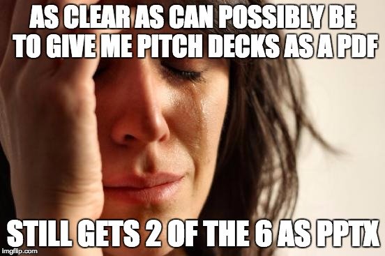
This is by far, the biggest problem we have with non-PDF pitch decks. And never ceases to amaze us, that so many startup founders out there are completely oblivious to the fact that how you put together something in PowerPoint on your computer, may look completely different on my computer when I get it.
This is a bit of an anomaly to me, and I am not proficient enough with the ins and outs of PowerPoint to know why it behaves the way it does. Sometimes we receive PowerPoint pitch decks where everything works perfectly fine. The animations works, embedded media works, everything looks beautiful.
The the next PowerPoint pitch deck will have a bunch of red x’s all over the place, half of the content work render properly, and fonts are obviously missing. I hate to say it, but this effects how we perceive you and your startup.
Again, I am no PowerPoint guru, and I don’t really know why or how this happens sometimes, or how to fix it, but that is not my job to know that. If you’re a startup founder and you’re sending your pitch deck to investors, accelerators, mentors, journalists, etc, IT IS YOUR RESPONSIBILITY to make sure that you and your startup are being represented in the best light possible. You should be testing your materials and making sure they look proper and beautiful everywhere.
If you send me crap files, there is a good chance that I am not going to give your pitch deck further consideration? Why?
- It is lazy and makes the work look extremely half-effort. While it may be not actually true, and maybe you did spend hours perfecting the document on your computer, it doesn’t matter. What matters is how it is perceived on the other end.
- There’s 1000’s of other startups there with properly formatted pitch decks that will properly get my undivided attention. And their pitch decks are likely PDF’s.
Simply put, if you want your pitch deck to reliably look the same on a PC, on your neighbor’s PC, on your boyfriend’s Mac, or on your sister’s Galaxy, make it a PDF. (Don’t even get us started on interoperability issues between PowerPoint and Keynote) The compression of the PDF will make sure everything works, and will give you the widest effective reach possible.
I mean come on. When’s the last time you went through a PowerPoint presentation on your smartphone and enjoyed it?
2. PDFs generally carry a friendlier file size
When you make a PowerPoint with all kinds of fancy transitions, effects, and other add-ons, the file size can get big quickly.
This can cause some annoyance for you, as you may now not be able to send your pitch deck via email. On the flip side, this makes things further inconvenient for the person you’re presenting to: Why should a potential investor or partner have to go through extra steps to be able to access your file?
Remember, you may be unique, but not matter what, you’re not alone. Investors especially are bombarded with requests day in, day out.
Any extra effort you bestow on someone to take in your information is just setting you up at a competitive disadvantage. Keep it simple. Chances are you’re using too much fluff anyways, and the things that are really driving up your file size are not that crucial anyways.
3. The things that make PowerPoint powerful, aren’t that important for you
Yet. No doubt, PowerPoint still has its place in the world. There’s a reason it’s still the most widely used presentation creation tool in the world.
Everyday there are people going out into the world and they are delivering inspirational, moving, and information presentations to their audiences.
Chances are, those people are giving the aforementioned presentations using PowerPoint. You are not that person right now. The biggest differentiator here is this performer is likely building the PowerPoint on their own computer, and that same computer will be used to deliver the performance. In other words, the quality and deliverance of the PowerPoint is 100% completely under the user’s control.
You as startup founders, are disseminating the information to various recipients, so how that PowerPoint will look is likely out of your control, unless you take the time to test everything properly. But why go through the extra headache? Just make a PDF, and again problem solved!
But back on point here, as a startup founder, you’re trying to convince someone why you should receive something. It doesn’t matter if that “something” is funding, a spot in a startup accelerator, or feedback, you’re trying to convince of something, that is in fact your goal. So all the animations and transitions that are not only driving up your file size, are also at this point simply not necessary.
As already mentioned, we see a lot of pitch decks here at the SpinLab. When a decision on a startup is being made on a startup after the pitch, I can assure you the topics we’re talking about can include, but are not limited to:
- The idea the startup has.
- The experience and compatibility of the team.
- Competition.
- How the startup’s product fits into the SpinLab’s portfolio.
- Internationalization opportunities.
- Technical challenges and limitations.
- Overall gaps in the business model.
What we are certainly NOT ever discussing is how beautiful a pitch deck was. No one has ever mentioned how they were absolutely blown away by the transition effects, or how the USP’s of the startup appeared one by one as the speaker was talking. I’m not fortune teller, but I am also fairly confident that no one ever will mention or notice these things.
We’ve just got bigger things to consider, and this is just a finer detail that is going to get missed in this environment.

4. Videos? Yeah you don't need those at this point yet either.
It’s a valid point, and one we have to consider. My personal opinion, if you cannot get your messaging across without the use of a video, you haven’t worked on your messaging on how you want to portray your brand long enough. (I know, typical marketer mentality right?).
That being said, there are some good videos out there that support the startup’s mission. But at the same time, if your pitch deck was good enough to capture my attention, chances are I’m looking up your website to do further due diligence on your product, and I’ll find the video on my own. This is typically the case with me and videos, they don’t need to be in the pitch deck itself for pitch deck to be successful on its own.
Always goes back to the origins, be clear, be concise, and do it with as little effort as possible.
Wrapping it all up into a nice little package.
Again, this article is solely based on the learnings we’ve had here from our own experiences at the SpinLab. But sometimes, it really does make me stop and wonder - How many great opportunities out there have been beat out by competition, just because their pitch decks were weak? We believe these are 3 very solid reasons to utilize a PDF pitch deck if you want to save time on your end, and make things easier for the people who are getting it.
What are your opinions and experiences? Have you had raging success with only PowerPoint thus far, and do you know how to quickly and easily resolve the issues I have listed with PowerPoint in the beginning of this article? Then let us know in the comments below, we’d love to hear your thoughts!


/RootCamp_Logo-Ecosystem.png?width=200&name=RootCamp_Logo-Ecosystem.png)
/Bitroad_Logo-Ecosystem.png?width=200&name=Bitroad_Logo-Ecosystem.png)


/White%20Versions/stadt_leipzig_white.png?width=130&name=stadt_leipzig_white.png)
/lfca_white.png?width=119&name=lfca_white.png)
/bmwi-white-engl-2022.png?width=573&name=bmwi-white-engl-2022.png)
/White%20Versions/sachsen_signet_white.png?width=90&height=362&name=sachsen_signet_white.png)